Кто я?
- доброжелюбный бородач
- пятый голос подкаста «Веб-стандарты»
- редактор ленты новостей по фронтенду
- организатор митапов, конференций и воркшопов
- разработчик интерфейсов в Яндекс.Поиске
Что такое «тач»?
- маленькое устройство
- управляется пальцем
- Android или iOS
- вертикальный экран
Что такое «тач»?
- маленькое устройство — не только
- управляется пальцем — не только
- Android или iOS — не только
- вертикальный экран — не только
Зачем нам знание про «тач»?
User-Agent: Mozilla/5.0 (Macintosh; Intel Mac OS X 10_14_6) AppleWebKit/537.36 (KHTML, like Gecko) Chrome/79.0.3945.130 Safari/537.36
Адаптивная
Отзывчивая вёрстка
/* Мониторы, ноутбуки */
@media (min-width: 1200px) {}

/* Планшеты в ландшафтном режиме, средние мониторы */
@media (min-width: 992px) and (max-width: 1199px) {}

/* Планшеты в портретном режиме, маленькие мониторы */
@media (min-width: 768px) and (max-width: 991px) {}

/* Телефоны в ландшафтном режиме, планшеты в портретном режиме */
@media (max-width: 767px) {}

/* Телефоны в портретном режиме */
@media (max-width: 480px) {}
Самостоятельные компоненты! 🤘
.cards {
    display: flex;
    flex-wrap: wrap;
    justify-content: space-between;
    margin-left: -1em;
}

.card {
    flex: 1 1;
    min-width: 200px;
    margin-left: 1em;
}
<picture>
    <source media="(min-width: 1150px)"
            srcset="img-desktop@1x.jpg 1x,
                    img-desktop@2x.jpg 2x">
    <img src="img-mobile@1x.jpg"
         srcset="img-mobile@2x.jpg 2x"
         width="20"
         height="18">
</picture>
Не загружать CSS?
<link rel="stylesheet"
      href="mobile.css"
      type="text/css"
      media="handheld" />
❌ DEPRECATED ❌
Media Types
Не загружать CSS!
<link rel="stylesheet"
      href="mobile.css"
      type="text/css"
      media="(max-width: 720px)" />
✅
Media Features
2
Использовать возможности
<meta name="viewport"
      content="width=device-width, initial-scale=1">
<meta>
initial-scale — уровень зума при загрузке;maximum-scale — максимальный уровень зума;minimum-scale — минимальный уровень зума;user-scalable — разрешён ли зум (правильный вариант yes).
@viewport {
    min-width: 640px;
    max-width: 800px;
}

@viewport {
    zoom: 0.75;
    min-zoom: 0.5;
    max-zoom: 0.9;
}

@viewport {
    orientation: landscape;
}
@viewport
touch-action
.e {
    touch-action: auto;
    touch-action: none;
    touch-action: pan-x;
    touch-action: pan-left;
    touch-action: pan-right;
    touch-action: pan-y;
    touch-action: pan-up;
    touch-action: pan-down;
    touch-action: pinch-zoom;
    touch-action: manipulation;
}
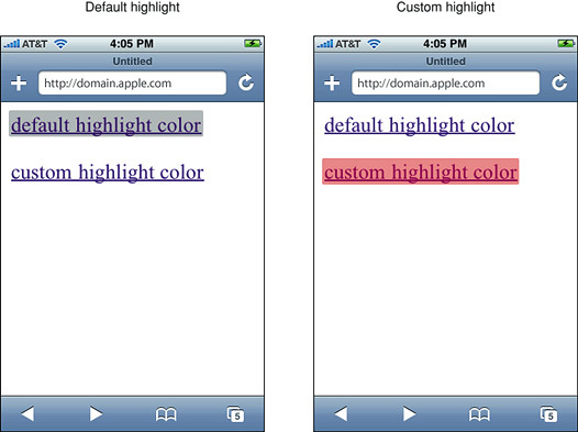
touch-action
-webkit-tap-highlight-color
.red-hl {
    -webkit-tap-highlight-color: red;
}

.no-hl {
    -webkit-tap-highlight-color: transparent;
}
-webkit-tap-highlight-color
user-select
.e {
    user-select: none;
    user-select: auto;
    user-select: text;
    user-select: contain;
    user-select: all;
}
user-select
.unselectable {
    -moz-user-select: none;
    -webkit-user-select: none;
    -ms-user-select: none;
    user-select: none;
}
text-size-adjust
.e {
    text-size-adjust: none;
    text-size-adjust: auto;

    text-size-adjust: 80%;
}
text-size-adjust
-webkit-touch-callout
.e {
    -webkit-touch-callout: default;
    -webkit-touch-callout: none;
}
<a href="javascript:alert();">
    I am Batman!
</a>
-webkit-touch-callout
«Липкий» скролл
body {
    scroll-snap-type: x mandatory;
}

section {
    height: 100vh;
    width: 100vw;
    scroll-snap-align: start;
}
Practical CSS Scroll Snapping
header {
    /* Высота статус-бара в iOS 10 */
    padding-top: 20px;

    /* Высота статус-бара в iOS 11.0 */
    padding-top: constant(safe-area-inset-top);

    /* Высота статус-бара в iOS 11+ */
    padding-top: env(safe-area-inset-top);
}
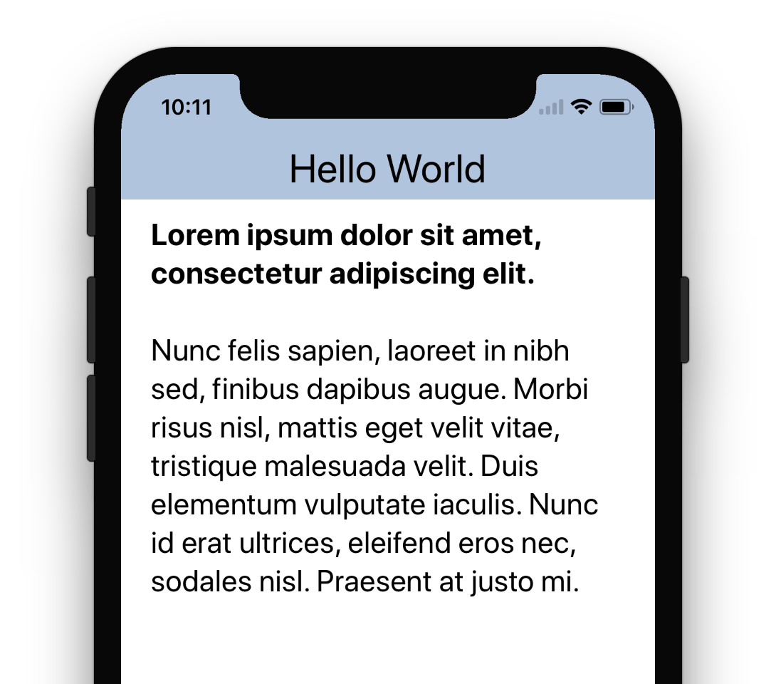
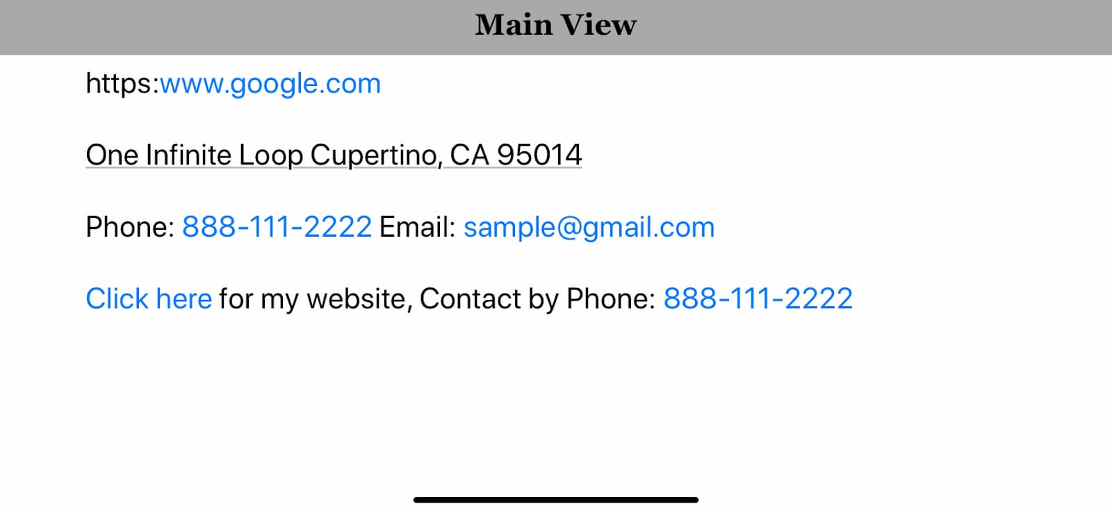
format-detection
<meta name="format-detection" content="telephone=no">
<meta name="format-detection" content="address=no">
<meta name="format-detection" content="date=no">
<meta name="format-detection" content="email=no">
How To Ban Blue Links on iOS Devices In Email
CSS-шлюзы
h1 { font-size: 1.25rem; }

@media (min-width: 20em) {
    h1 {
        font-size: calc(1.25rem + 1.25 * (100vw - 20rem) / 40);
    }
}
@media (min-width: 60em) {
    h1 {
        font-size: calc(1.25rem + 1.25 * 1rem);
    }
}
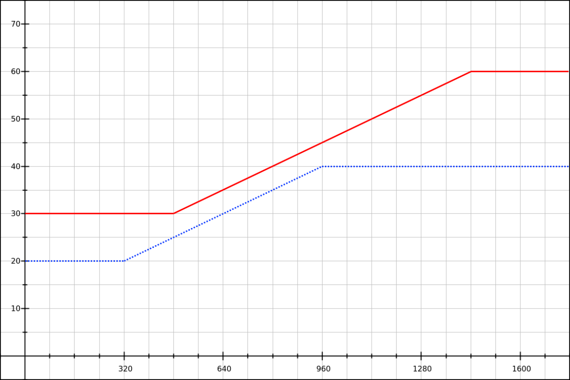
Математика CSS-шлюзов
<head>
    <style>
        :root {
            --color-fg: #000;
            --color-bg: #fff;
        }
        @media (prefers-color-scheme: dark) {
            :root {
                --color-fg: #fff;
                --color-bg: #000;
            }
        }
    </style>
</head>
FOUDT: Flash of Unstyled Dark Theme
Отдавайте только нужное ⚖️
Используйте возможности ⚡️
Помните об ограничениях ☎️


 Html, CSS and JavaScript tricks for mobile websites
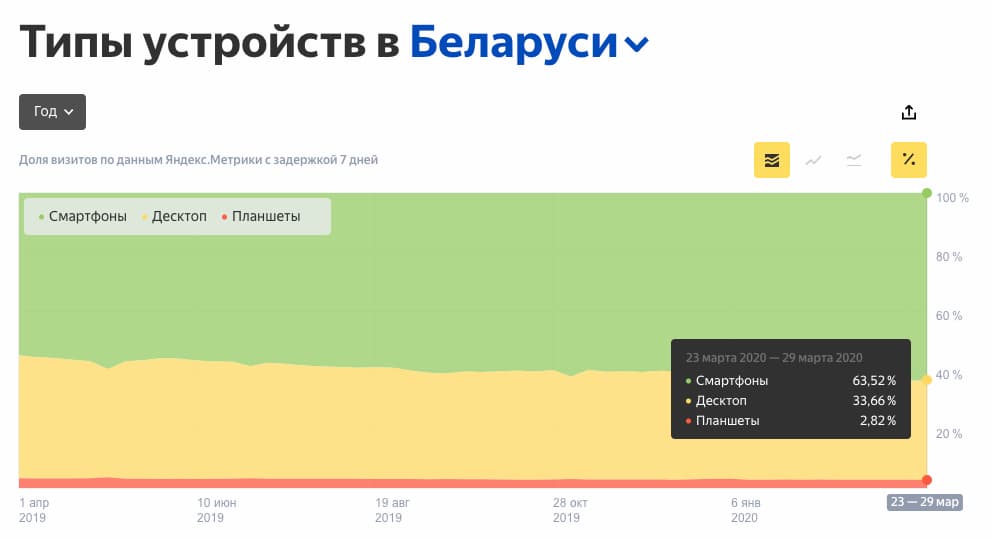 Типы устройств в Беларуси — Яндекс.Радар
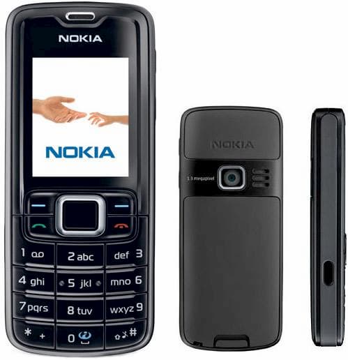
 Apps for smart feature phones

 youtube.com/watch?v=srUZ9E4qQlQ
 Customizing Style Sheets
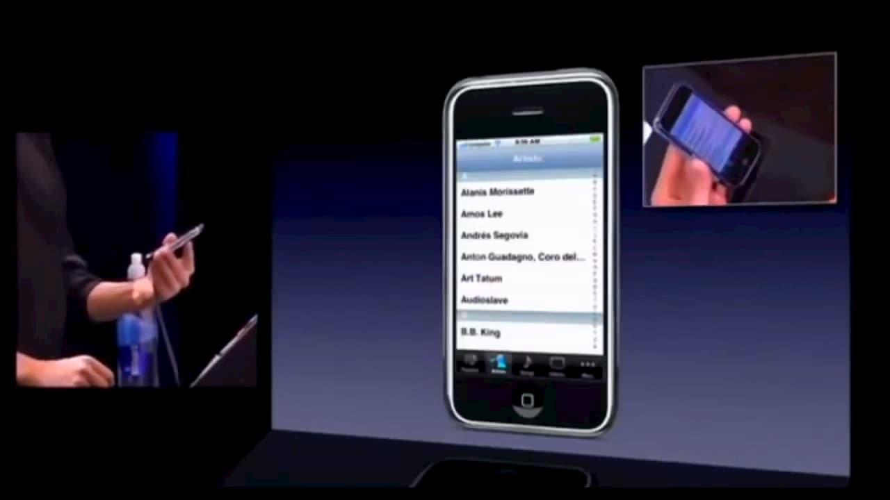 Audience Reacts to Steve Jobs Scrolling on an iPhone (2007)
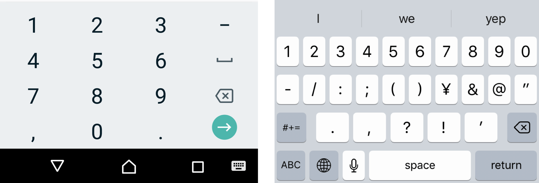 Everything You Ever Wanted to Know About inputmode
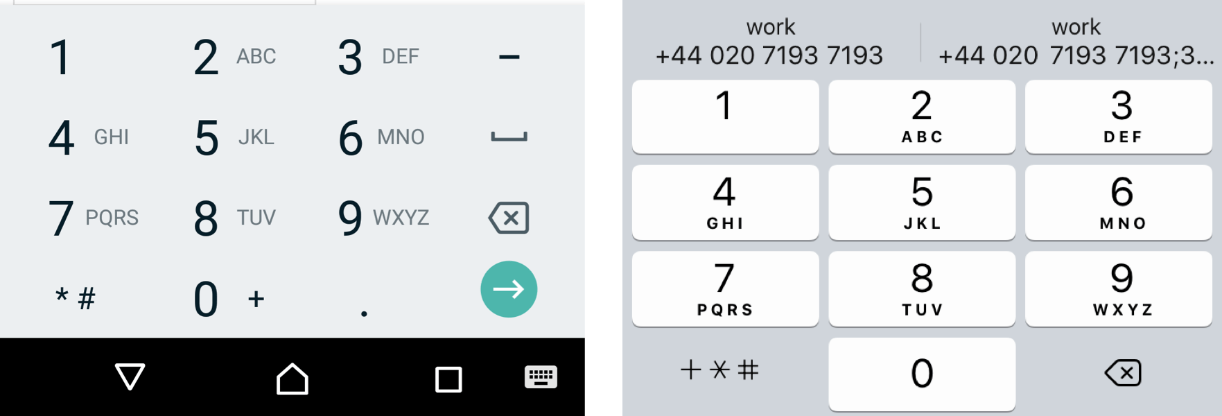 Everything You Ever Wanted to Know About inputmode
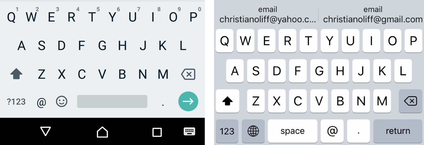 Everything You Ever Wanted to Know About inputmode
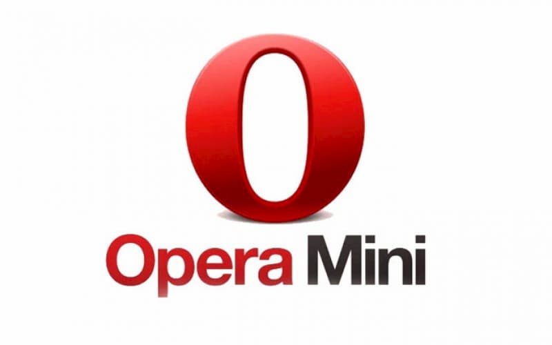
 Loading web pages fast on a $20 feature phone
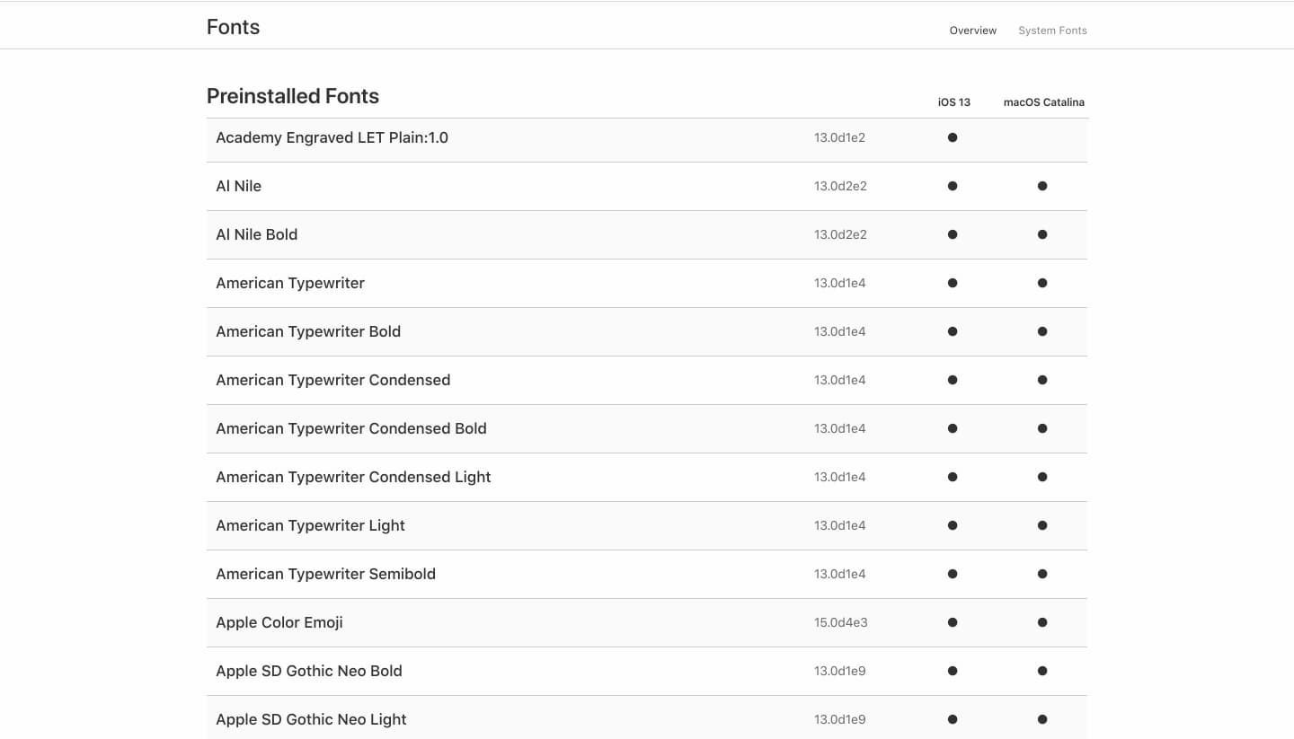 Preinstalled Fonts
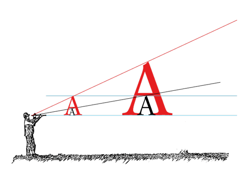 Основы адаптивной типографики
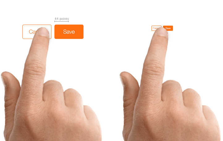 UI Design Do’s and Don’ts